Key Concepts
After collection of data, it is necessary to represent data in a precise manner so that it is easily understood. Representation of data in a visual manner is known as its Graphical Presentation or simply, Graphs. Data can also be presented in the form of a table; however a graphical form is easier to understand. Consider the family of Mr. Khanna. They are very fond of eating ice-creams. Some like butterscotch, some like vanilla flavor, some like strawberry and the rest of them likes chocolate. Some demand cones & some of them demand cups. A child of VIII class decides to construct the graphs according to their amount of icecreams consumed. There are 7 ways of representing the data.

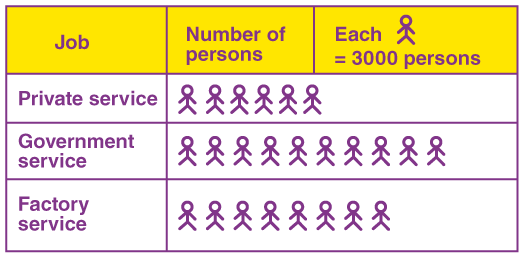
- Find out the number of persons employed in private service?
- In which service, the maximum number of persons were employed?
Solution:
Given that, one symbol = 3000 persons.
(a) The number of persons employed in private service = 6 × 3000 = 18000 persons.
(b) The maximum number of persons were employed in government service.
I.e., 10 × 3000 = 30000 persons.
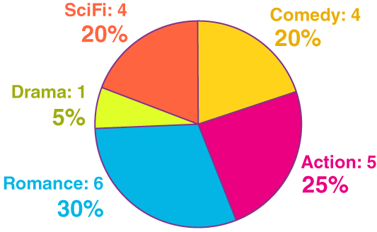
Draw the pie chart for the given observations, that shows the survey of different types of movies.
| Action | Comedy | Romance | Sci-Fi | Drama |
| 5 | 4 | 6 | 4 | 1 |
Solution:
From the given observation, total = 20.
Now, divide each value by 20 and multiply by 100 to get the percentage.
Action – (5/20)100 = 25%
Comedy – (4/20)100 = 20%
Romance = (6/20)100 = 30%
Sci-Fi = (4/20)100 = 20%
Drama = (1/20)100 = 5%
Now, we have to find the degree of each slice (sector).
Action – (5/20)360°= 90°
Comedy – (4/20)360°= 72°
Romance = (6/20)360°=108°
Sci-Fi = (4/20)360°= 72°
Drama = (1/20)360°= 18°
Hence, the pie chart for the obtained information is:


